From product to brand. How to translate a meaningful brand purpose into a consistent design language across multiple product categories.

Consistency is the key to any brand.

Two digital presentation slides featuring a female tennis player and a tennis racket with branding. The slides are labeled 'OURMISSION' and 'OURIDENTITY' with content about tennis and branding details, set against a black and white background.

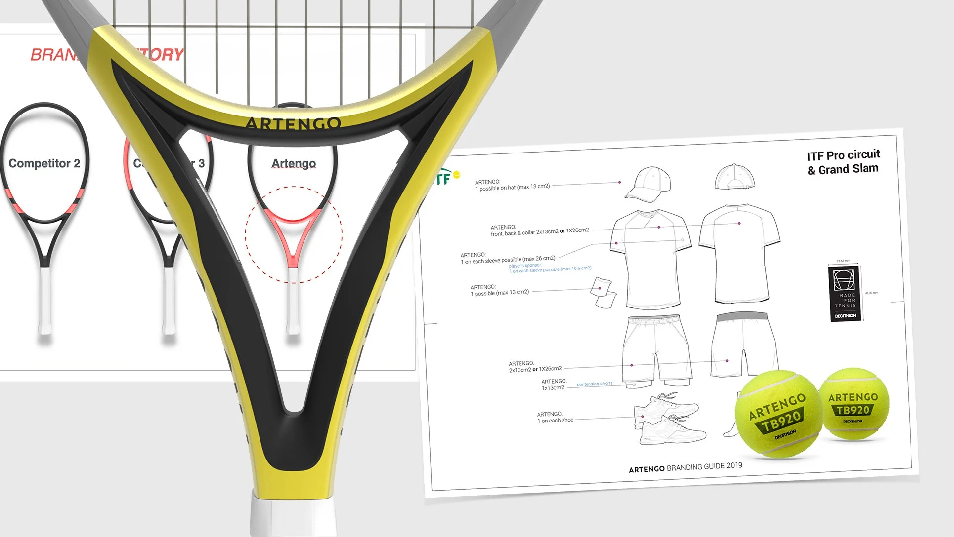
From the company’s purpose to the detailed branding rules, design translates strategic C-suite decks into tangible products.

Every word finds its translation into a shape, a material or a colour.
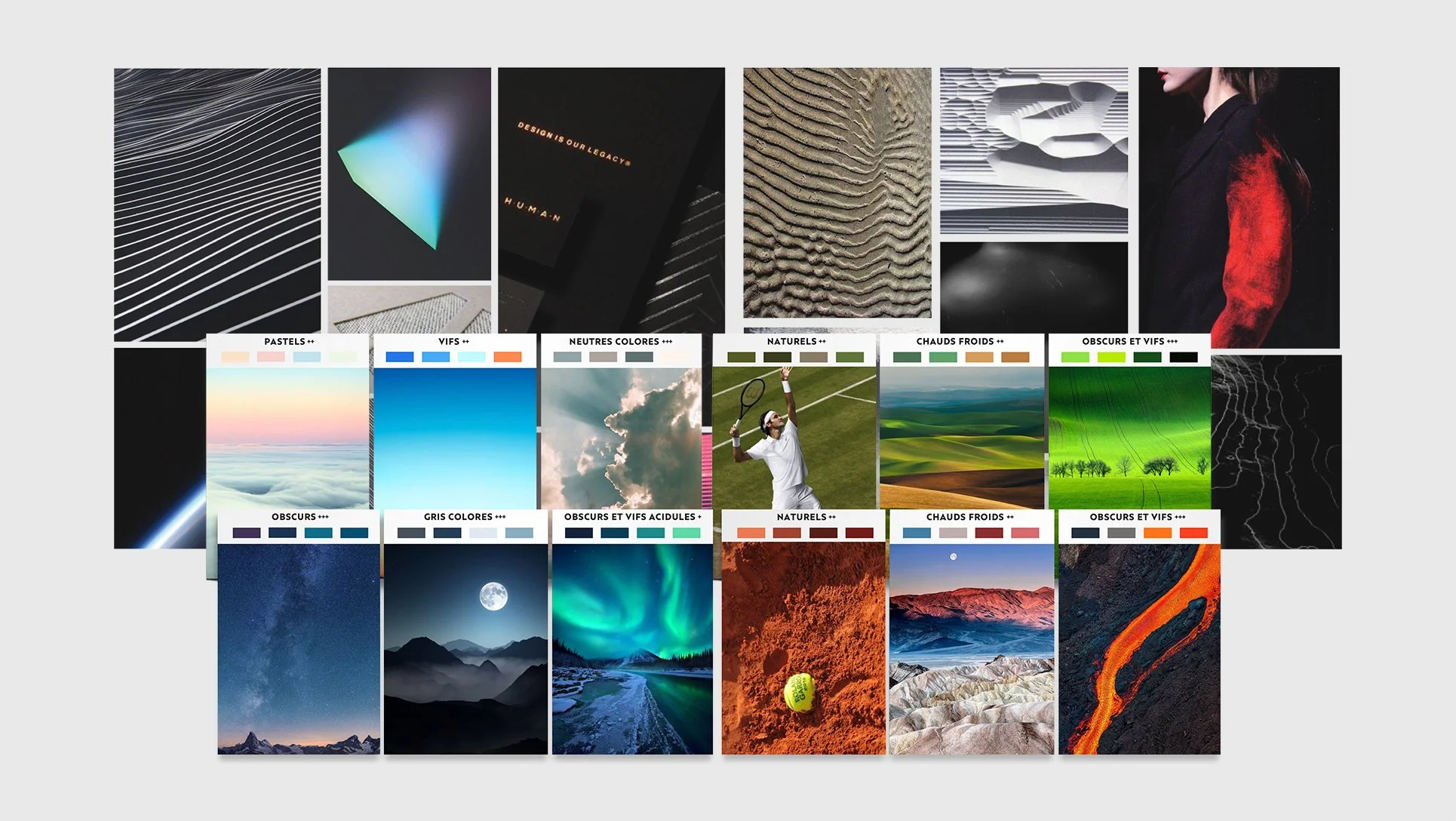
A yellow and black tennis racket with the brand name 'ARTENGO' on it, placed in front of a branding guide and tennis balls with the same brand, alongside technical drawings and specifications for tennis apparel and equipment.
A pair of athletic running shoes with peach and navy blue colors suspended in mid-air, with orange dirt-like particles flying around them on a plain background.

Between Air & Earth

Collage of various nature and landscape photographs, including the night sky, mountains, and desert, alongside color palette swatches with labels such as Pastels, Vifs, Neutrals, Naturels, Chauds Froids, and Obscurs et Vifs.
Four tennis outfits displayed on mannequins against a white background, each consisting of a shirt and shorts in various colors and designs.

Creative direction: S. Hadjidimoff

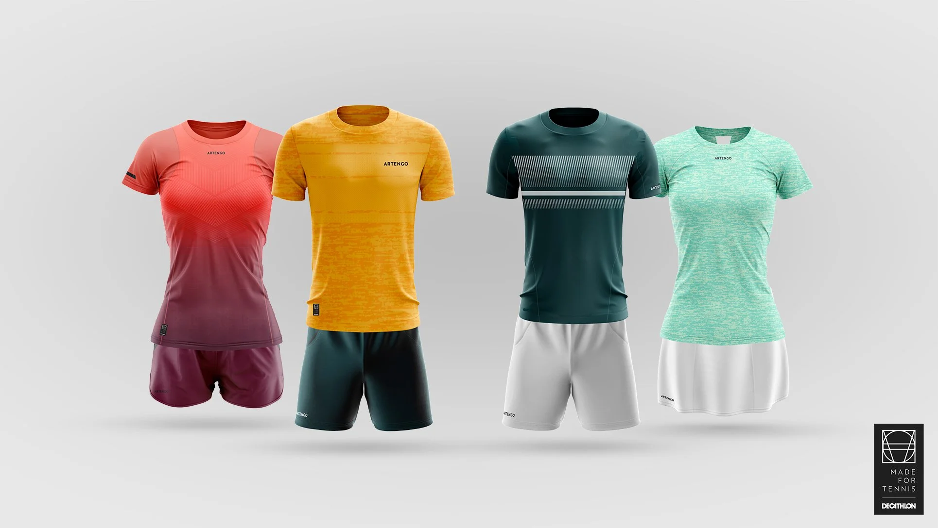
Design: Artengo design team 2018-2019 (SS 2019)